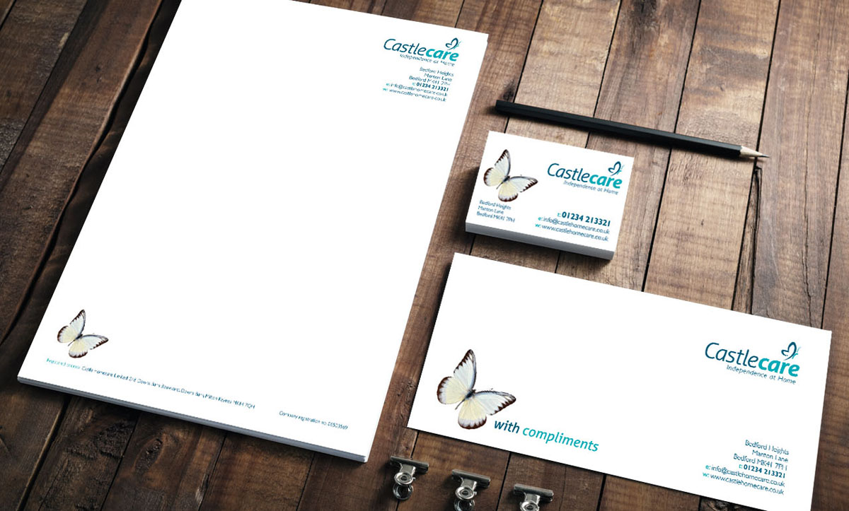
A fresh identity for a home care provider.
Having recently re-branded Castlecare, Abrahams Creative has now rolled out the new look across all their corporate literature.
Castlecare is a specialist provider of quality home care services based in Bedford and covering the surrounding counties. Their ethos is to enable people to live independently within their own home. Allowing them to live their life as they wish, with the right levels of care and support. The Castlecare team aspire to be the care provider and employer of choice for local people.
Throughout the brand development process the key message driving the design concepts has been ‘freedom and independence’. A butterfly is used in the logo and also appears throughout the literature as a strong visual metaphor. I always research the logos and branding of a clients’ key competitors as part of the design process. I am therefore confident that Castlecare’s new, fresh branding will make them stand out in a crowded marketplace. Some examples of the corporate literature are shown below.
Redesigning the marketing material
A simple, but high quality, four page, 210mm square brochure with a matt laminate cover uses images of happy people to convey the Castlecare story. This brochure will be sent out in a pack to new customers or potential carers who request information about the company. For flexibility, 210 square, single and double-sided inserts (not shown) have also been created. These cover topics such as fees or recruitment and can be added to the pack if relevant. The inserts are a cost-effective way to add or change existing information at a later date without having to re-print the main brochure.
An A5 leaflet and a range of newspaper adverts complement the corporate brochure. All the material follow the clean, simple style and together create a strong, easily recognisable Castlecare brand.
| ADVERTISEMENTS | BROCHURE | FOLDER & INSERTS | IDENTITY | LEAFLETS | LITERATURE | STATIONERY | WEBSITE |


